 reveals feeling “how the hell did I get through it” while shooting Trial of Seven")
 on being drawn to darker roles")
 says he has watched A Knight of the Seven Kingdoms “too many times”")


")


")


 by Joe Abercrombie")
 @ChannelFred")


 Euron – The First Storm and the Last")
 | Game of Thrones")


Home Box Office continues its Create for the Throne initiative and this time around, it is back with four new pieces of art in contrast to the crafty expertise on exhibition displayed the previous time around. This initiative is HBO’s effort to promote the final season of Game of Thrones by inviting eighteen different artists to make something which represents a theme of Game of Thrones.
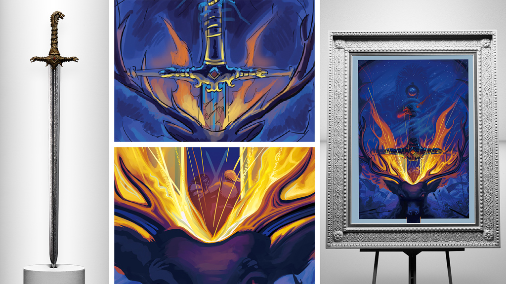
Robert Ball decided that making a portrait of the Oathkeeper would be the best thing to do for him. He decided to seek symbolism in his art and turned to make the painting out of shades of Blue and Red to symbolise the conflict between Ice and Fire. He then decided to portray the OathKeeper’s most notable moment which was the execution of Stannis Baratheon during his failed siege of Winterfell. There are many finer details to this portrait which envelop the story from Season 1 to 6 and even before that. For example, the Lion Head has been converted to a Wolf, while the red comet has been included as an omen of victory for the Lannisters. Furthermore, the fire has also been shaped like the Wings of a Dragon. This intricate piece of art has been quite well thought out and represents a deep story in its details.
“The challenge was really balancing all the elements so that it works as a striking image if you don’t know Oathkeeper’s story, but there are layers there if you do,” said Ball.”I had to exaggerate the pommel of Ice so that it could be seen ghosted behind Oathkeeper. I also had to make sure that Ned was recognizable, holding the sword without dominating the image.”
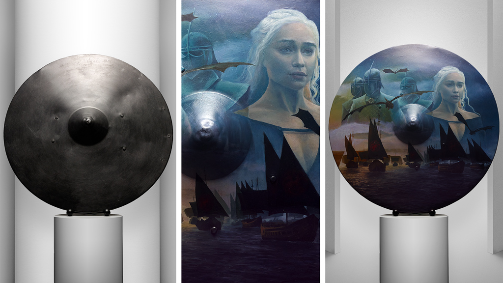
The next artist to be featured is Lena Danya and she attempted to make the Unsullied shield. She wanted to include water, the Unsullied, the ships, Dragons, and Daenerys; all to represent the house of the Targaryens. She referenced quite a few scenes from Season 6 and 7 and decided to make a chalk outline on the shield and then colour over it using oil paints. She reportedly wanted the painting to seem like a distant memory and hence created more of a fading scene from the ocean to the sky. She also wanted to capture the moments of stillness after a battle and used the colours of the sunset to portray the same.
“Working around the shape of the shield was a challenge I anticipated,” said Danya. “I’m so used to creating paintings on completely flat surfaces, where light reflects evenly. The shield was curved and had a protruding center point, so when it came to painting the top of the shield, too much light reflected off those areas and it was hard to see values accurately. With painting the bottom of the shield, not enough light was reaching certain areas, causing them to appear darker. To combat this, I had to shift the position and height of my easel constantly, as well as my lighting set up.”
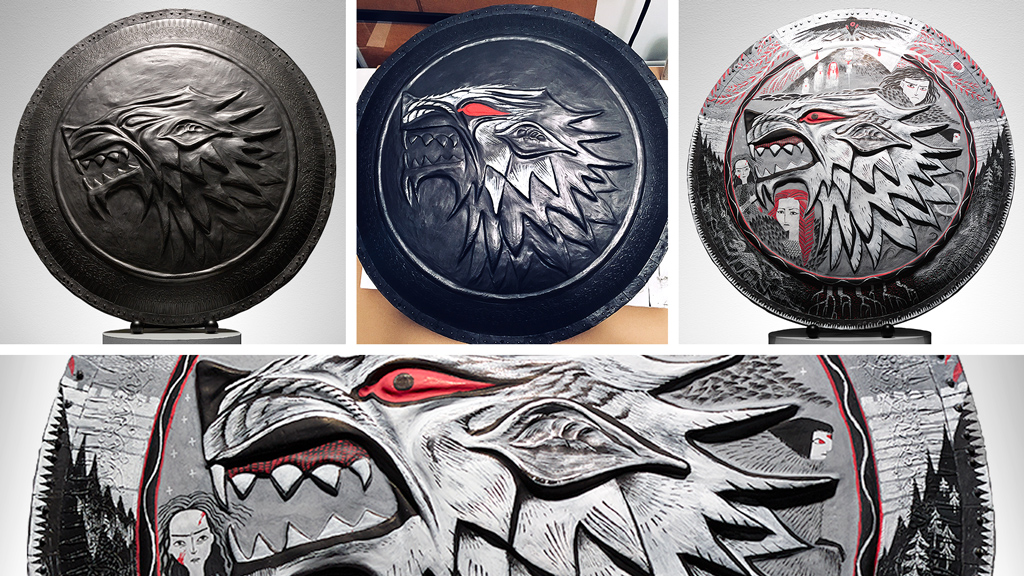
Next up was Eva Eskalinen with her rendition of the Stark Shield. She started off with a digital painting before heading on to the shield. She wanted to include most of the symbols related to the Starks. She also wanted to represent the supernatural powers at play and all the remaining and deceased members of the Stark family. She further drew inspiration from Jon Snow’s ghost and decided to draw the Direwolf, with the palettes to Red and White.
“Being from Finland, I believe that the harsh nature and climate shape people, like the Starks — the individual grit, perseverance and the strength of the pack that are needed to survive,” said Eskalinen. “The Starks are all quite stern and serious in my illustration; the snow and the dark forests are there as well. The style of the illustration is rather graphic, borrowing inspiration from medieval art and Scandinavian design — which I hoped will bring out the rawness and bareness I associate with the North.”
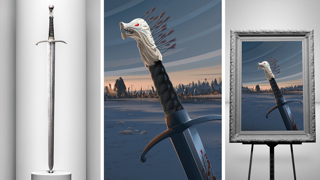
The final work of art exhibited was the Longclaw by Laurent Durieux. He went with this portrait pretty much the same way he would go with any other portrait of his, by first drawing it on paper and then removing all outlines and digitally colouring the picture.
“I start by drawing some quick rough ideas on paper,” explained Durieux. “Once I have something I think works, I colorize it. When the concept is solidified, I start gathering all sorts of references and documentation in order to be as accurate as possible. Then I start the black and white drawing and final composition. The next step is the coloring and rendering with my digital cross-hatching. I delete the black outline by colorizing it. It’s very tedious and time-consuming but the final result is worth it.”
This makes it eight works of art out of eighteen. The next instalment should be around sooner than expected. Until then, fans eagerly await the release of the final season of Game of Thrones which is set of premier on April 14.
Image Credits: Making Game of Thrones
 reveals feeling “how the hell did I get through it” while shooting Trial of Seven")
 on being drawn to darker roles")
 says he has watched A Knight of the Seven Kingdoms “too many times”")