


")


")


 by Joe Abercrombie")
 @ChannelFred")


 Euron – The First Storm and the Last")
 | Game of Thrones")


In an age when Netflix’s “Skip Intro” button threatens to make a TV show’s opening credits into an endangered species, it’s more important than ever to acknowledge the work being done by the artists who set the tone for some of the year’s most notable series. “I have two jobs,” says two-time Emmy winner Patrick Clair, nominated this year for the haunting introduction to “True Detective” Season 3. “The main title needs to prove its worth — and also make it worth watching again and again.” His fellow nominees in the main title design category share that philosophy, while also revealing how they went about innovating — or in some cases, re-innovating — the art of these brief yet stunning sequences.
CREDIT: Courtesy of Netflix
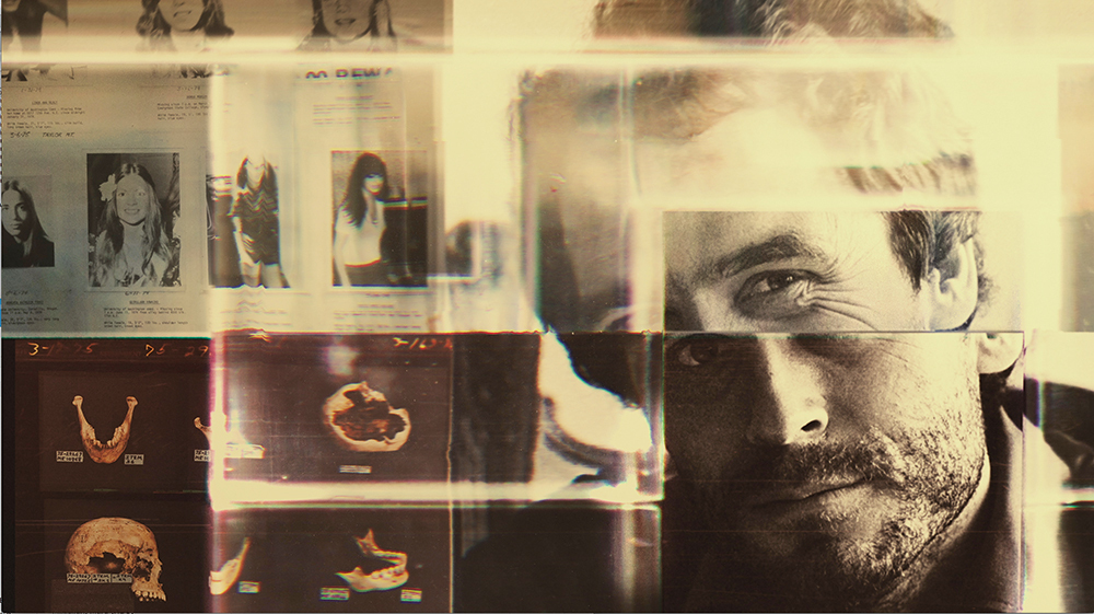
“Conversations With a Killer: The Ted Bundy Tapes”
(Netflix)
Elastic creative director Lisa Bolan was inspired by the actual cassette tape technology that captured those original interviews in her introduction to this true crime series, which heavily features audio of notorious serial killer Ted Bundy being interviewed on death row. “His warped sense of self [and] his glib and arrogant spin on the extreme violence of his crimes inspired the idea of using a clear cassette tape as a lens through which we see from his POV the real Ted,” she says. The aesthetic let her showcase “how plastic magnifies and distorts imagery passing through the cassette,” including not just photos that reflected the era but also the women whose lives were taken by Bundy, including Georgann Hawkins and Denise Naslund. “I wanted to show the layered artifice of Ted: his plastic smile, the mask worn to attract the help of kindhearted people. The title image is that mask pulled away.”
CREDIT: Courtesy of HBO
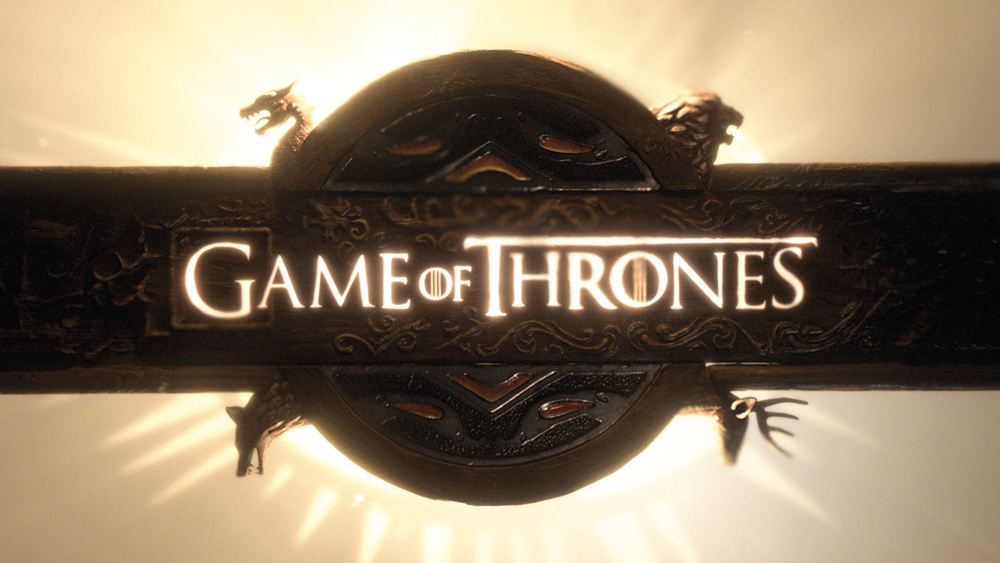
“Game of Thrones”
(HBO)
The final season of 2019’s most-nominated drama was an occasion for the Elastic team to do something it had wanted to do for years: completely redesign the viewer’s introduction to Westeros. “With the action in the final season happening between two primary locations instead of all over the world, as in previous seasons, we finally had reason to do a reboot,” says creative director Angus Wall. “The team had been chomping at the bit to utilize all of the technical advances that had been made during the almost decade since we produced the first season’s main title.” The sequence thus introduces a brand-new perspective on notable sites including the crypts of Winterfell and the throne room of the Red Keep. The only limit to the team’s imagination, art director Kirk Shintani says, was having to make sure that the titles still matched, in terms of length, with composer Ramin Djawadi’s iconic opening theme.

CREDIT: Courtesy of CBS
“Star Trek: Discovery”
(CBS All Access)
Creative director Ana Criado didn’t know anything about “Star Trek” before being asked to design the striking images that come into definition during the “Discovery” opening credits. But to her that was an advantage, because the series was a prequel to the original, and so executive producer Alex Kurtzman and the network wanted something that didn’t look like any past “Trek” opening credits. “I felt free with the aesthetics,” she says. The second-season credits build on the first year’s with an assortment of designs reflecting fresh elements of the narrative, such as the addition of the captain’s chair to represent the arrival of the character Christopher Pike and more Vulcan-themed images in honor of the return of Spock. But the credits remained true to a “clear and bright” aesthetic that draws on such inspirations as Leonardo da Vinci’s “Vitruvian Man” sketch, reflecting how the show represents “the renaissance of humans,” Criado says.
CREDIT: Courtesy of HBO
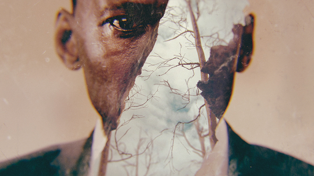
“True Detective”
(HBO)
The team behind the opening titles of “True Detective” had to adapt the established aesthetic that led to an Emmy win in Season 1, as well as include evocative images from Season 3 to make it unique from past years. An unusual aspect of the series’ opening titles is that they feature photos of the cast, something that is rare these days, Clair says. In order to do so, the team went through production dailies to find “moments that feel evocative,” and also capture the fact that the season stretches across a 30-year period. Focusing on the cast, Clair says, is important because “’True Detective’ is really about creating a portrait of the leads — so we’re trying to explore the way [Mahershala Ali’s Wayne Hays’] perspective has changed. It’s really all about him and his wife, and focusing in on their emotions in the moment.”
CREDIT: Courtesy of Method Studios/Cinemax
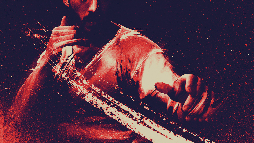
“Warrior”
(Cinemax)
Given that the martial arts drama draws its inspiration from the writings of Bruce Lee, it’s not a shock that the vibrant opening titles invoke plenty of kung fu action. But John Likens of Method Studios says the team also wanted to reflect the show’s modern sensibilities. So the opening titles feature an aesthetic inspired both by graphic novels and by retro kung fu posters. In an additional nod to the show’s core elements, the on-screen text appears in English and Chinese, with the “Warrior” production team helping to ensure that each phrase was accurately translated. “That’s something that’s super important to them on the production side,” Likens says. “Even if they didn’t give us a translator, we would have gone out and found one.”